
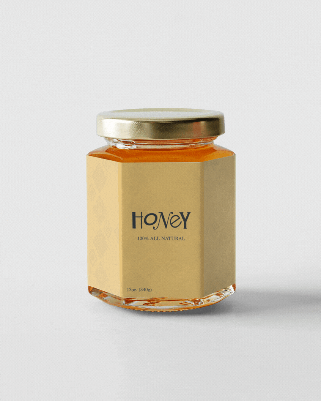
Honey
High Point University’s pro bono Physical Therapy Clinic partners with the local Giving Garden to support community food access. One of their initiatives is selling locally sourced honey at a campus-adjacent market. They engaged me to design a label and brand identity that would reflect the product’s story and attract customers.
Objectives
Create a label that feels warm, natural, and trustworthy
Make the design legible at small sizes and under varying lighting (markets, stalls)
Design for flexibility: multiple jar sizes, front and back labels, ingredient & warning info
Align with the mission of food aid and community empowerment
Design Rationale
The conceptual objective behind the Honey brand packaging was to establish a visually distinctive and immediately recognizable identity for the product. Drawing on the natural associations of honey, the color palette was thoughtfully composed using various shades of yellow, red, and blue, each selected to evoke both the essence and vibrancy of the product. Functional considerations guided the arrangement of the packaging information. Ingredient listings and consumption precautions for children are clearly displayed on the reverse, ensuring both transparency and consumer safety. The typographic approach integrates a custom blend of typefaces, including original forms, designed to foster a lighthearted yet professional aesthetic that aligns with the brand’s friendly character and quality standards.
